
Diamond Color: What the D-to-Z Grading Scale Shows
A guide to diamond color: where the visible steps in the D-to-Z scale actually fall, how it reads in each metal, and which grades matter.
Diamond color is graded on a scale from D to Z, measuring how much yellow or brown tint a stone has against a diamond with none at all, and the scale matters because that tint changes how white the stone looks to the eye, not how well it sparkles. This article covers colour alone — for cut, see diamond cut, for clarity see diamond clarity, and for carat see the diamond carat size guide.
What the D-to-Z scale actually measures
D is the top of the scale: completely colourless, with no visible tint even to a trained grader under controlled lighting. The scale runs down through E and F, still considered colourless, into G through J, described as near-colourless, and continues down to Z, where the tint is strong enough to be visibly yellow or brown even to an untrained eye. The letters themselves don’t correspond to equal visual steps — some neighbouring grades are nearly indistinguishable, while others mark a real jump in visible tint, which is the part of the scale most buyers never get explained to them.
Where the visible steps actually are, not the letter-by-letter ones
Most people can’t tell a D from an E from an F without side-by-side comparison under a loupe, which is why near-colourless grades, particularly G and H, are where the best value sits: the tint is effectively invisible once a stone is set, but the price is well below a D or E of the same cut and clarity. The more noticeable step comes further down the scale, around K and below, where a warm tint becomes visible to the eye even without comparison, especially in a larger stone or a stone set in white metal. Buying by the visible step rather than chasing the top letter grade is where most of the value in this decision actually is.
How colour reads differently depending on the metal
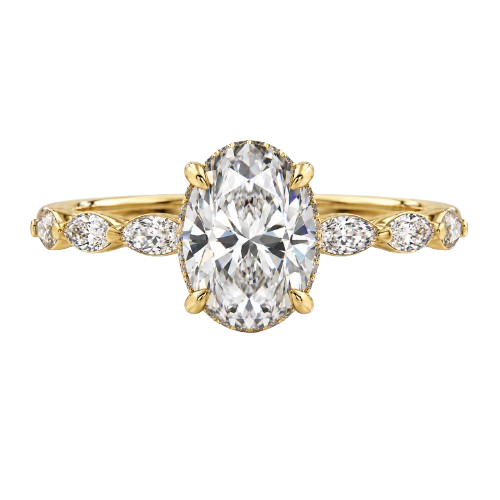
The metal a diamond is set in changes how its colour looks to the eye, which is worth factoring in before paying for a higher grade than the setting will show. Yellow gold reflects warm tones back into the stone, which can mask a slightly lower colour grade and make it look whiter than it would in a cooler setting. White gold and platinum do the opposite: they throw cool, bright light around the stone, which makes any warm tint more visible, so a stone set in white metal benefits more from a higher colour grade than the same stone would in yellow or rose gold.
Colour in a larger stone, and across shapes
Colour tint becomes more visible as a stone gets larger, because there’s simply more material for light to pass through and pick up tint from, which is part of why a 2-carat diamond ring is often set with a colour grade a buyer could comfortably skip on a smaller stone. Shape matters too: a round brilliant hides tint relatively well because of how it returns light, while step-cut shapes such as emerald and asscher, with large open facets, show body colour more plainly and are usually worth a grade or two higher to avoid a visible tint pooling in the stone’s centre.
Does colour read differently in a set stone than a loose one?
A set stone almost always looks whiter than the same stone did loose, because the metal around it, the backing behind it, and the smaller stones often surrounding it all change what your eye compares the colour against. A loose diamond on a white paper grading tray is judged against nothing but white, which is the strictest possible comparison and the reason loose stones can look more tinted than they will once mounted. Once set, the diamond is judged by eye against its setting and its surroundings rather than against a blank white background, which is also why two stones a grade apart can look identical once both are set, even though a grader could tell them apart loose under controlled light.
A halo or pavé surround changes that comparison further, because the centre stone is now seen next to a ring of smaller stones rather than against metal or skin alone. If the surrounding melee is a noticeably whiter grade than the centre stone, the contrast makes the centre stone’s tint more visible than it would be on its own, which is the opposite of the effect most people expect from a halo. Matching the centre stone’s colour grade closer to the melee around it, rather than treating them as separate decisions, is what keeps a halo or pavé setting looking like one consistent colour rather than drawing attention to the one grade that doesn’t match.
Which diamond color grades are actually worth paying for
For most settings and most stone sizes, G to I is the range that gives the best balance: no visible tint once set, at a meaningfully lower price than D to F. Paying for D to F only makes a visible difference in a large stone, an open step-cut shape, or a setting in white gold or platinum where the stone is otherwise fully exposed to view. Below J, the tint becomes something to weigh deliberately rather than default away from, particularly in a stone over a carat. Every stone’s colour grade sits on its certificate alongside cut and clarity, and reading the certificate rather than relying on a description is covered in understanding your certificate.
Choosing a colour grade for your own stone
The right colour grade depends on the metal, the shape and the size you’ve already decided on, which is why it’s worth settling those first and choosing colour last. CIZELE’s certified stones, natural and lab-grown, are viewable individually with their own certificates, and a video consultation is the place to see a specific stone’s colour under light rather than guessing from a letter on a page. Fluorescence can also shift how a stone’s colour reads, which is covered separately in diamond fluorescence.
Once you’ve found the balance of colour, cut, clarity and carat that suits your budget and setting, CIZELE’s design tool is where the piece actually gets built around that stone, or message directly on WhatsApp with the grade range you’re weighing.